Do you want to develop an Android application with an attractive appearance and a better user experience? Or are you still confused about what kind of UI components you should implement when you want to develop a feature in your application?
If so, you must know what Material Design is and the components it provides. In this article, we will dig deeper into what Material Design components are and how they can enrich the UI design of the Android applications you develop.
What is the meaning of Material Design?
Material Design is a design system developed by developers and designers from Google to help you develop products that are more visually attractive and easier for users to use.
Material Design presents a set of components that you can use to build interactive and attractive user interfaces. The latest version of Material Design is Material 3 or also known as Material You. Apart from Android, Material Design is also available on Flutter and the web.
What are the elements of Material Design?
Components in Material Design are the basic foundation used when building a user interface or appearance in an application. Each of these components can be grouped into six categories based on their respective purposes, namely action, containment, communication, navigation, selection, and text input. Are you curious about the details? Read the following explanation.
1. Action Components
Take the case of e-commerce applications as an example. What do you do when you want to checkout a product? Press the checkout button. What if you want to save a product to your favorite page or wishlist? Press the favorite button icon.
The buttons provided are an example of action components. As the name suggests, action components are components that help users achieve a goal or perform certain actions in the application.
Material Design has several types of button components that can be used to carry out actions or interactions according to their respective contexts. Starting from common buttons, floating action buttons (FAB), extended FAB, icon buttons, to segmented buttons.
2. Communication Components
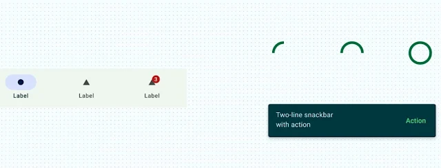
Communication components are Material Design components that aim to provide useful information to users. For example, notifying the status of a process using Progress Indicators, displaying alert messages using Snackbar, or displaying the number of notifications using Badges.
3. Containment Components
Containment components are useful for grouping information and actions, including grouping other components too, such as buttons or menus so that the UI becomes more structured in the eyes of the user. Some of the containment components available in Material Design include Bottom sheets, Cards, Carousel, Dialogs, Dividers, Lists, Side sheets, and Tooltips.
4. Navigation Components
Generally an application will have more than one page, but how can users move from one page to another easily and without confusion? The answer is to use navigation components. As the name suggests, the navigation component makes it easier for users to move between pages in the UI.
Material Design provides several different components for navigating within the application, starting from the Bottom app bar, Navigation bar, Navigation drawer, Navigation rail, Search, Tabs, to the Top app bar.
5. Selection Components
When using an application, sometimes users will also be faced with interactions to determine a choice. Starting from determining the number of products you want to buy, selecting language options in settings, turning off or turning on dark mode in applications, and so on. This interaction uses selection components, namely components that allow users to determine their choices.
Selection components provided by Material Design include Checkboxes, Chips, Date pickers, Menus, Radio buttons, Sliders, Switches, and Time pickers. These components are generally often found on settings pages, forms, or filtering menus.
6. Text Input Components
If you want to request data from the user, such as username, password, name or email. Of course we need an input component so that users can enter this data. That is the use of text input components, namely components that allow users to enter or edit text. You can use the Text fields component provided by Material Design to facilitate users in providing text input.
Conclusion
We already know Material Design as a design system developed by Google to improve the visual appearance and user experience in Android applications. We also know the categories of Material Design components based on their respective purposes so that they can be used to build interactive and attractive UI displays.
Material Design components are divided into six categories: action components, communication components, containment components, navigation components, selection components, and text input components. Each category has its own role and function in enriching the user interface design of Android applications.
After understanding the components of Material Design, are you ready to implement them in the application you are developing?


